I’ve created a motion system that have been helping animation studios, agencies and freelancers, who work with Slack to produce high-quality animated content, contributing to the growth and recognition of Slack branding.
Full guidelines can be found here: https://brand.slackhq.com/motion
Motion design
A little movement can provoke an animated response. These guidelines will help you move your audience through the use of motion.
Highlights
These animation principles apply to all types of animation at Slack
Animation should draw the eye to what’s most important within a scene
Illustrations and characters must come from our existing library
Slack motion design values
These values inform how we approach motion design in all our projects.
Engaging Keep the viewer interested without distracting them
Purposeful Tell a story and lead the viewer through it
Clear Present complex ideas in ways that are easily understood
Delightful Imbue animation with a spirit of playfulness
Animation principles
Welcome to our animation constitution! Let these principles guide you in your movements, but please avoid cartoonish exaggeration in your animation. Aim for “playful,” not “silly.”
Staging
Bring focus to what's most important within a scene. Every movement should direct the eye to where it needs to be.
Overshoot
Animations should go a little beyond their final pose, then
settle back into that pose.

Follow through
Each object has its own unique inertia, which should be reflected in the animation. Avoid stopping objects all at the
same time.

Anticipation
Elements should have a realistic wind-up before large movements to prepare the viewer for the coming action.

Easing
Easing specifies the rate of change of a parameter over time. While we don’t adhere to strict easing values, we employ it
when needed to smooth out animations.
Slack logo
When animating the Slack logo, keep these rules in mind:
- Stick to the original brand shapes and proportions when building the animation
- Always adhere to brand guidelines around logo usage
Choose either the looping or non-looping logo depending on what works best with your animation.
Looping animation
Non-looping animation


Brand shapes
The way we animate shapes expresses the personality of our brand while conveying abstract meaning. Shapes can be animated to function as accents, transitions or background fills.
Our brand shapes have their origins in the Slack logo and can be used to create patterns and compositions in tandem with photography and text. Shapes may be used as solid complete forms or decoupled for additional variation.
A few rules to help shape your compositions:
- Always use the full shape with its original proportions
- Do not collapse or distort shapes
- Do not bump shapes into each other
For more details on using our brand shapes, see Brand shapes.
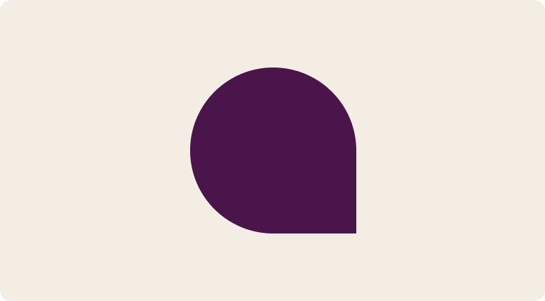
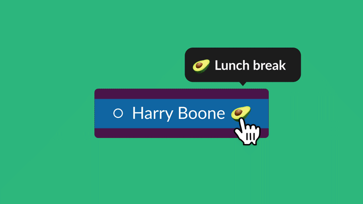
Chat bubble
Chat bubbles should be scaled proportionally. Don’t combine chat bubbles and pill shapes into a single form.
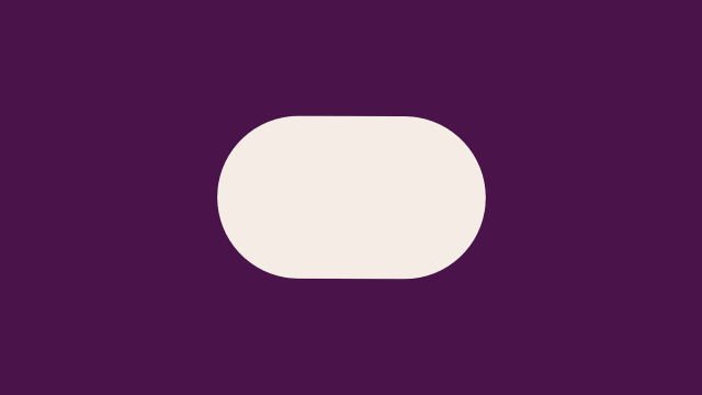
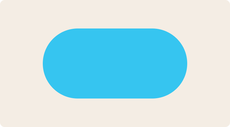
Pill
Pills can be shortened or extended based on the application. Don’t combine pills and chat bubbles into a single form.
Examples
The chat bubble and pill shapes are used as intro fills and transitions for banner ads.
Bumpers
We use a standard video bumper at the end of our video and animated content.
Transitions
We use a standard video bumper at the end of our video and animated content.
Hard cut
Move from one shot to another without any transitional element.

Match cut
On action, match a similar element, shape or motion to flow between scenes.
The shape, size and location of the cursor matches between the two shots
The UI in the first shot matches the shape of the table in the second
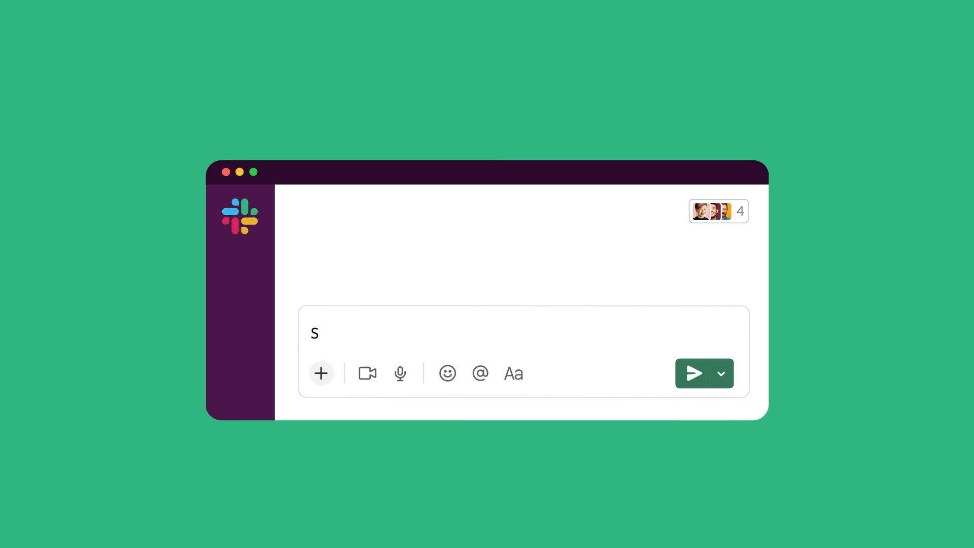
Text animation
We animate text, including words and numbers, to add emphasis and clarity.
- Text animation should always add to legibility, not subtract from it
- When text is animating, keep all other animation on screen to a minimum
- Ensure you provide enough time in the animation to read text before introducing new text on screen (generally enough time to read it aloud twice)
- Never animate character by character
- Stick to our brand typefaces
We animate text, including words and numbers, to add emphasis and clarity.
Title animation
For standalone titles, all text slides up from the mask simultaneously.

Phrase animation
For phrases of two or more words, text slides up with animated opacity word-by-word.

Examples

Use this animation for standalone titles
Use this animation for longer phrases (two or more words)
2D animation
We apply all our basic animation principles to 2D animation at Slack. Here are a few more to follow:
- Focus on one core action
- Add secondary motion to the main animated object where appropriate, but don’t overdo it
- Don’t use motion blur with 2D animation—instead, create animated smears
- Keep it fluid—aim for synchronization and harmony between multiple moving elements
- Don’t use soft or blurred drop shadows

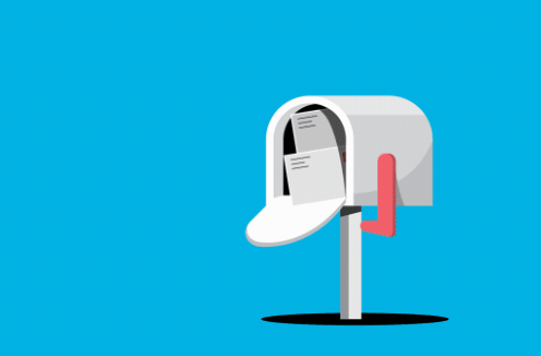
Mail flies from one mailbox to another, hanging in the air for a beat to add character. The flag and door react to the motion of the envelopes.
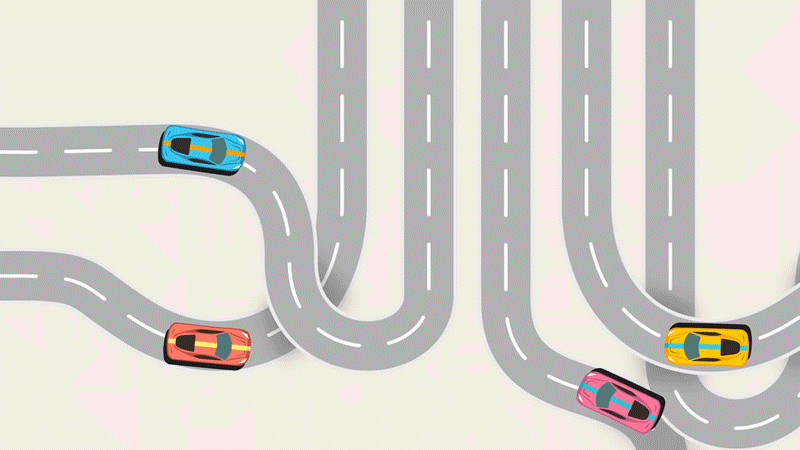
Cars move slower at the start, then speed up to emphasize alignment
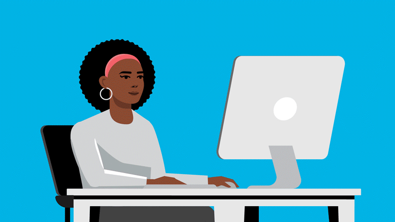
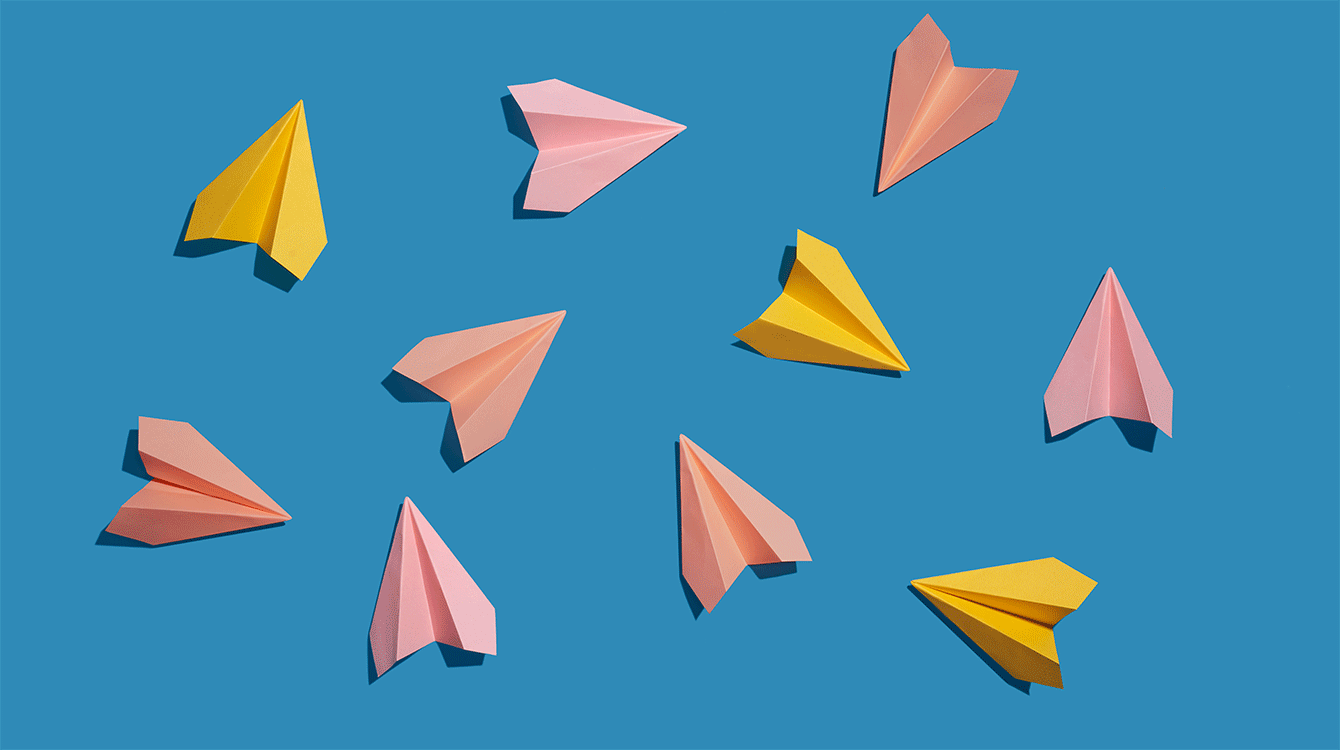
Illustrations
We animate illustrations within larger compositions to add delight or help simplify complex ideas. A few broad strokes to keep in mind:
- Use illustrations from our library, and follow animation principles
- The animation should be informed by the context of the illustration (where it lives) and its purpose (what it needs to communicate)
For more details on our illustration style, see the Slack illustration guidelines.

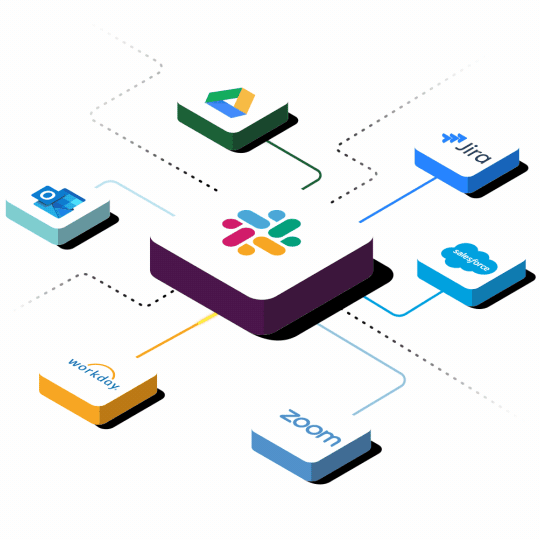
Growth is captured in light, upward motion
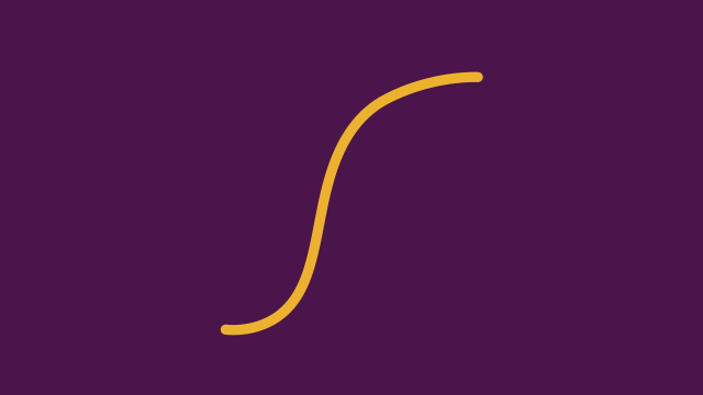
Waving lines convey energy and show how integrations are connected to Slack

As a hero graphic, this animation reveals more information, which is broken down further on the page
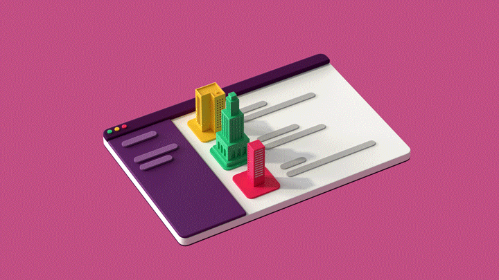
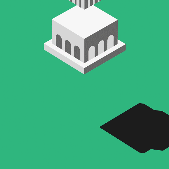
This office building is turned into a logo with a secondary motion
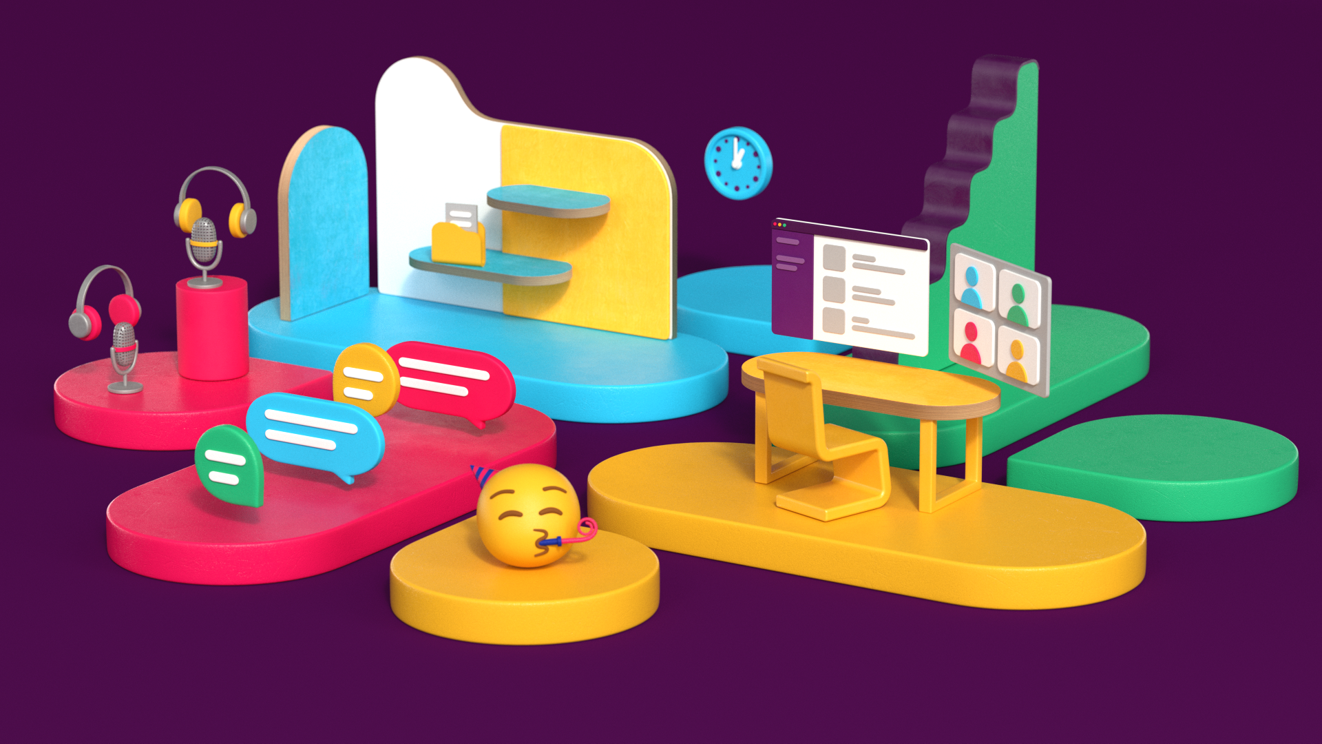
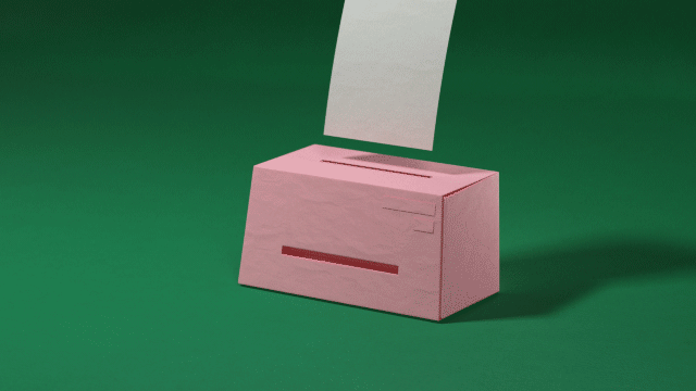
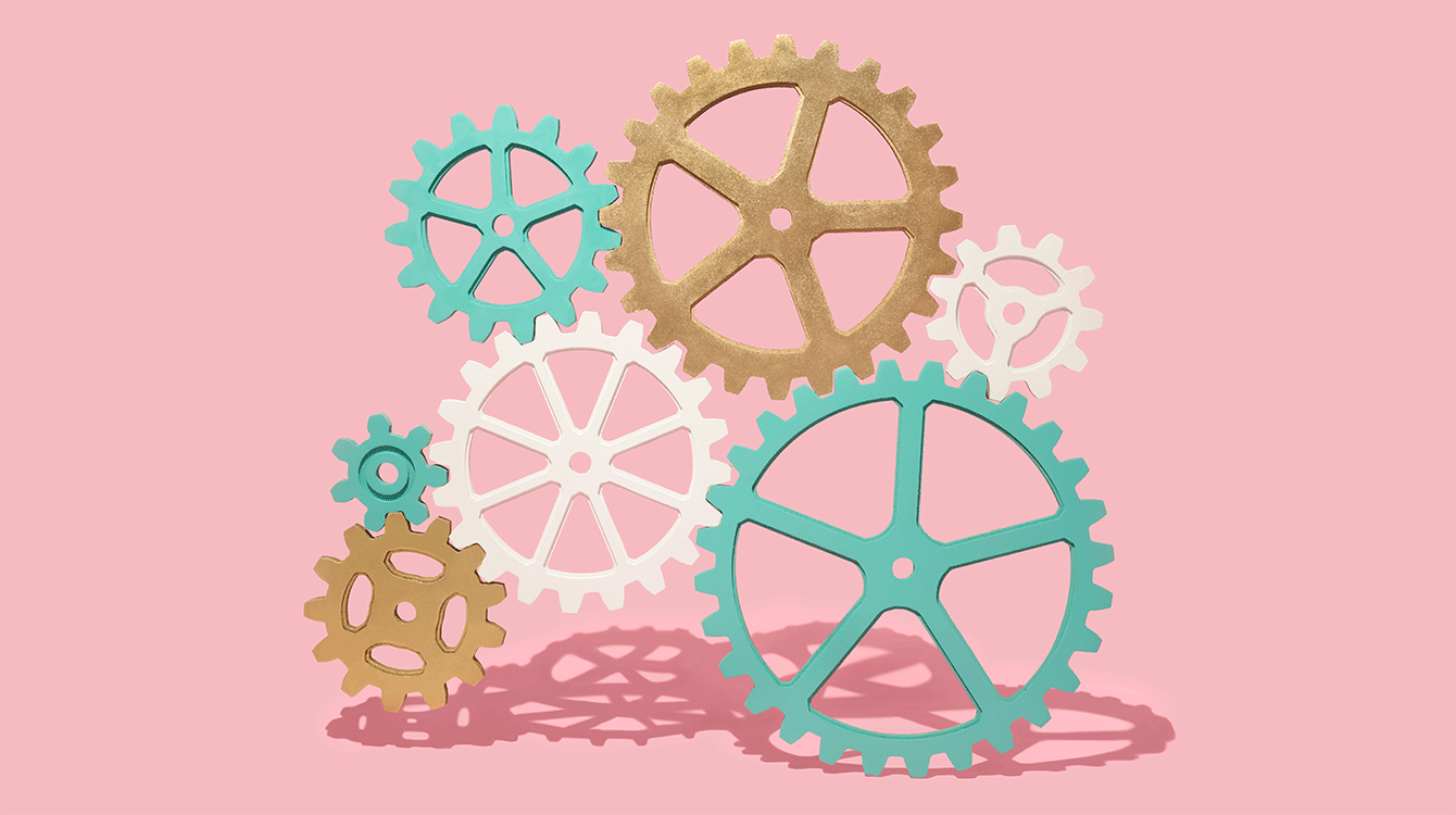
3D design and animation
3D design and animation is often incorporated into our video content—it's a balance between stylized and realistic approaches. Use the following principles to add dimension to your design:
- 3D design at Slack is stylized, but shouldn’t look like a toy
- Make the scene the star—keep details on individual models to a minimum
- Avoid sharp edges on 3D models. All rounding should be the same on all objects in a scene
- Use subtle details in your textures, but don’t overdo it
- Use 135–300 mm focal length on a camera to achieve stylized/flattened look
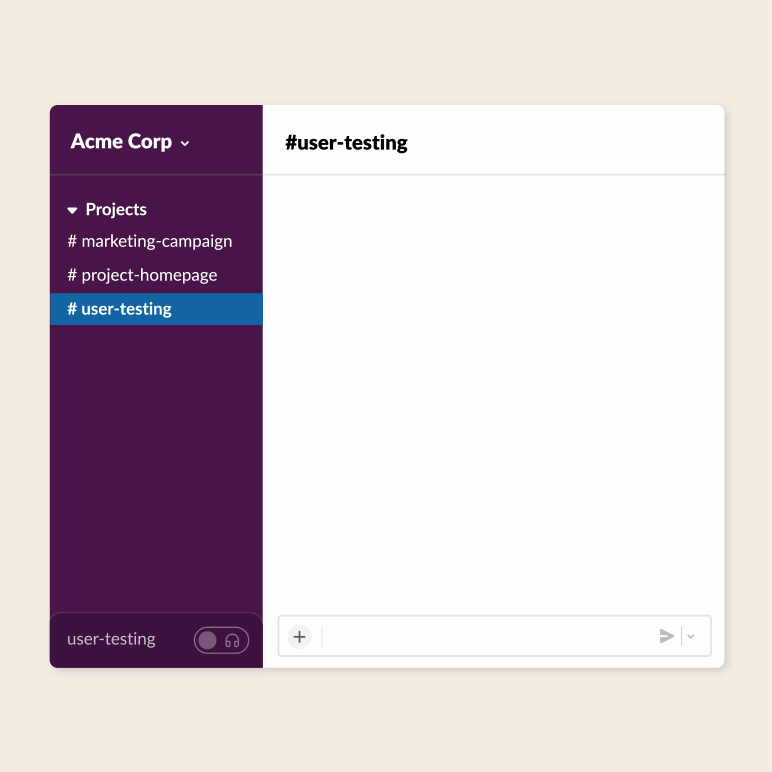
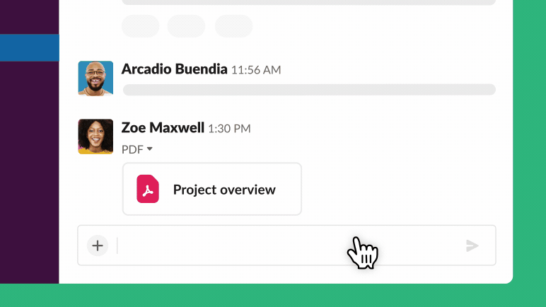
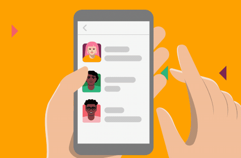
Product UI
Animating the Slack UI is one of the core ways we communicate what Slack is and how it works. With that in mind, there are slight variations in style depending on whether the animation will be used for web, for marketing and social media, or in an instructional capacity.
First up, some general guidelines:
- Let the main element you’re animating be the star of the show
- Simplify accompanying elements so as not to distract
- Include only relevant UI components
- Use motion and speed to keep users engaged
- Limit cursor movement, zooming and panning
Web
Web UI animations offer an overview of how people communicate in Slack. They set expectations and provide context for a feature, then show full examples of that feature in action. Typically, recommended file specs are MP4, GIF, or WebM, preferably under 3 MB and with no audio unless necessary.
Enjoy these friendly neighborhood tenets of web animation:
- Keep motion light and simple
- Loop animations
- Focus on one core action

Marketing and social media
In marketing and social use cases, animations generally highlight one specific feature, action or capability. They are easily digestible and more expressive than instructional UI. Please like and subscribe to these design ideas:
- Use abstraction to keep the focus on whatever you’re highlighting
- Use dynamic animation to capture attention and focus

Instructional
Instructional UI animations give an in-depth, accurate look at how to accomplish specific actions within the product. They are most authentic to the actual Slack interface. Here are a few how-to’s when it comes to instructing through animation:
- Reduce distraction by using abstraction
- Pace these as walkthrough tutorials so users can follow along

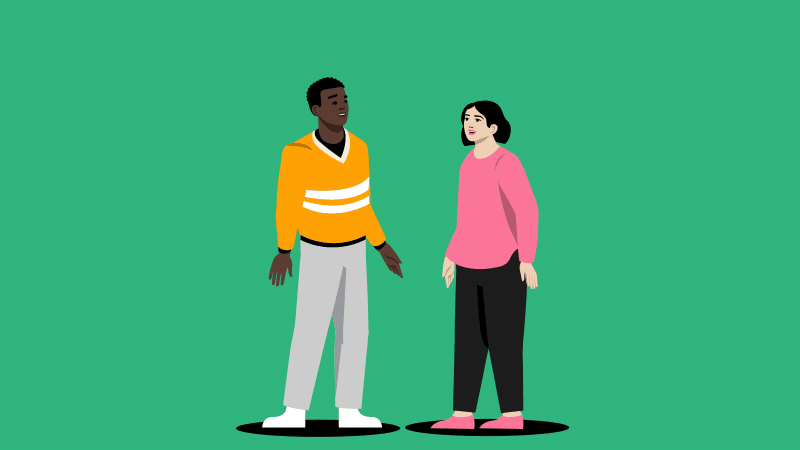
Character animation
Characters are some of the most complex animation types at Slack. They should be undertaken only by motion designers with extensive experience in character animation. If you’re new to this, make sure to reach out to someone a bit more seasoned.
Here are a few additional details to give your characters some personality:
- Characters must only come from the Slack illustration library. Do not create your own characters
- Character animation should follow all the animation principles
- Don’t use motion blur with 2D character animation. Instead, create animated smears
Stop-motion animation
We animate still life photography in a stop-motion style to communicate or reinforce larger concepts. These can also be employed to add some life to static imagery.
Bring your images into focus with these tips:
- Shoot on a solid-colored background per Resources library color themes
- Consider context when setting up composition. Do you want everything contained within the frame, or should certain elements bleed over the edge?
- You can also create stop-motion animation in 3D
For more details on our photography style, see our photography guidelines.
For more details on our photography style, see our photography guidelines.

Sound
Sound design (consisting of music, sound effects and voiceover) is an important part of any motion design project. Music sets the mood and pace of the animation, sound effects emphasize key moments to make them more realistic, and voiceover literally tells the story.
Usage
A few key reminders as you set your plans into motion.

Don’t use motion blur with 2D Don’t make any element of your animation too distracting
Don’t animate characters if you haven’t done it before
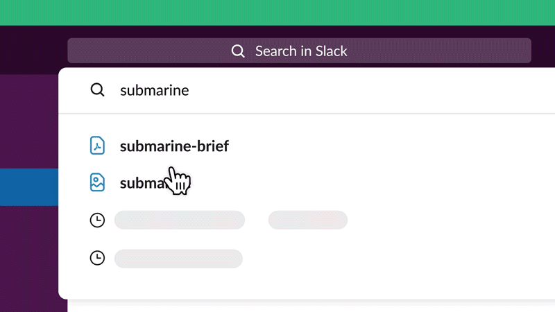
How it looks like on Slack Brand website